President Bill Clinton’s 1992 campaign is famous for coining the phrase, “It’s the Economy, Stupid!” in reference to the importance of the economy when it comes to elections. This brings the question of which economic indicators can predict the election more accurately. In this blog, I will explore the relationships between key economic variables and voting data in order to see which display greater correlations.
How Inflation Affects the Incumbent Party in the House of Representatives
Over the course of the previous year, Americans have been strained by rocketing inflation that reached an annualized rate of 9.1%, the highest in 40 years. With people hurting at the gas pump and in the grocery store aisles alike, many predicted that the Democrats, who hold unified control of the White House and Congress, are set for a rude awakening come the midterm elections this November. With political experts floating the notion that high inflation solely will motivate voters to eject the party in power, I decided to investigate the historical data concerning inflation, more specifically Consumer Price Index (CPI), which is “a measure of the average change over time in the prices paid by urban consumers for a market basket of consumer goods and services,” according to the Bureau of Labor Statistics. Scholars Andrew Healy and Gabriel Lenz have documented how voters tend to have short term biases, meaning they overweigh the last year of an incumbent’s term when heading to the ballot box. Thus, in the plots below, I display the vote share and seat share recieved by the incumbent party in the House only in midterm elections and the change in CPI from August to November of that midterm election year to account for voters’ short term bias.
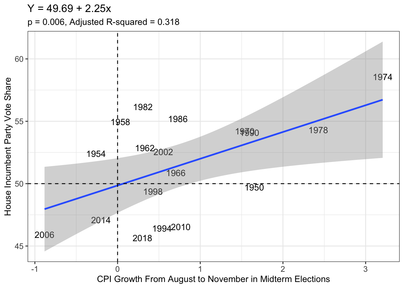
Here we see a strong, positive relationship with a correlation coefficient of 0.595. However, we are confronted by the data with the notion that increasing inflation actually is rather good for the incumbent party of the House: an increase by one point in the CPI results in a 2.25 percentage point increase in the House incumbent party’s vote share. This statistical relationship seems to suggest, come this November, that the Democrats will blowout their Republican counterparts on the ballot. In fact, if the election were held today, and we used the most recently published consecutive 4-month sequence on CPI (May - August) which tallies to be a 2.4% increase over that period, Democrats would be predicted to win 55.1% of the vote. On the day of this blog post, FiveThirtyEight’s 2022 House Forecast predicts the Republicans win by a margin of +2.6%. Even though my model does not account for third parties unlike FiveThirtyEight’s, its predicted +10.1% margin victory for Democrats is an unrealistic one.
Effects on the Democratic Party’s Seat Share in the House
A party’s seat share is where the real power is held because it is possible for a party to win an overwhelming majority of the popular vote and yet still find themselves in the minority without the ability to enact their agenda. To keep this model applicable to this year’s midterm election, I am modeling the Democratic Party’s seat share (incumbent partyin the House this term). This plot displays the same trend: an increasing CPI in the run-up to an election is correlated (although weaker than the vote share) to the Democratic Party’s seat share.
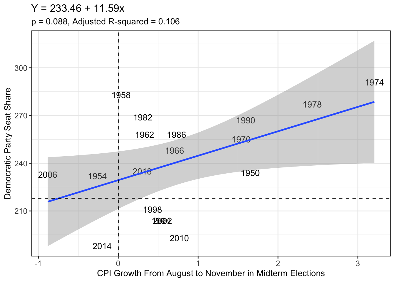
With the current change in inflation from May to August sitting at 2.4%, this model predicts the Democrats will win a super majority at just over 261 seats, a reality no one can imagine.
What Happens When A Democratic President is in Office
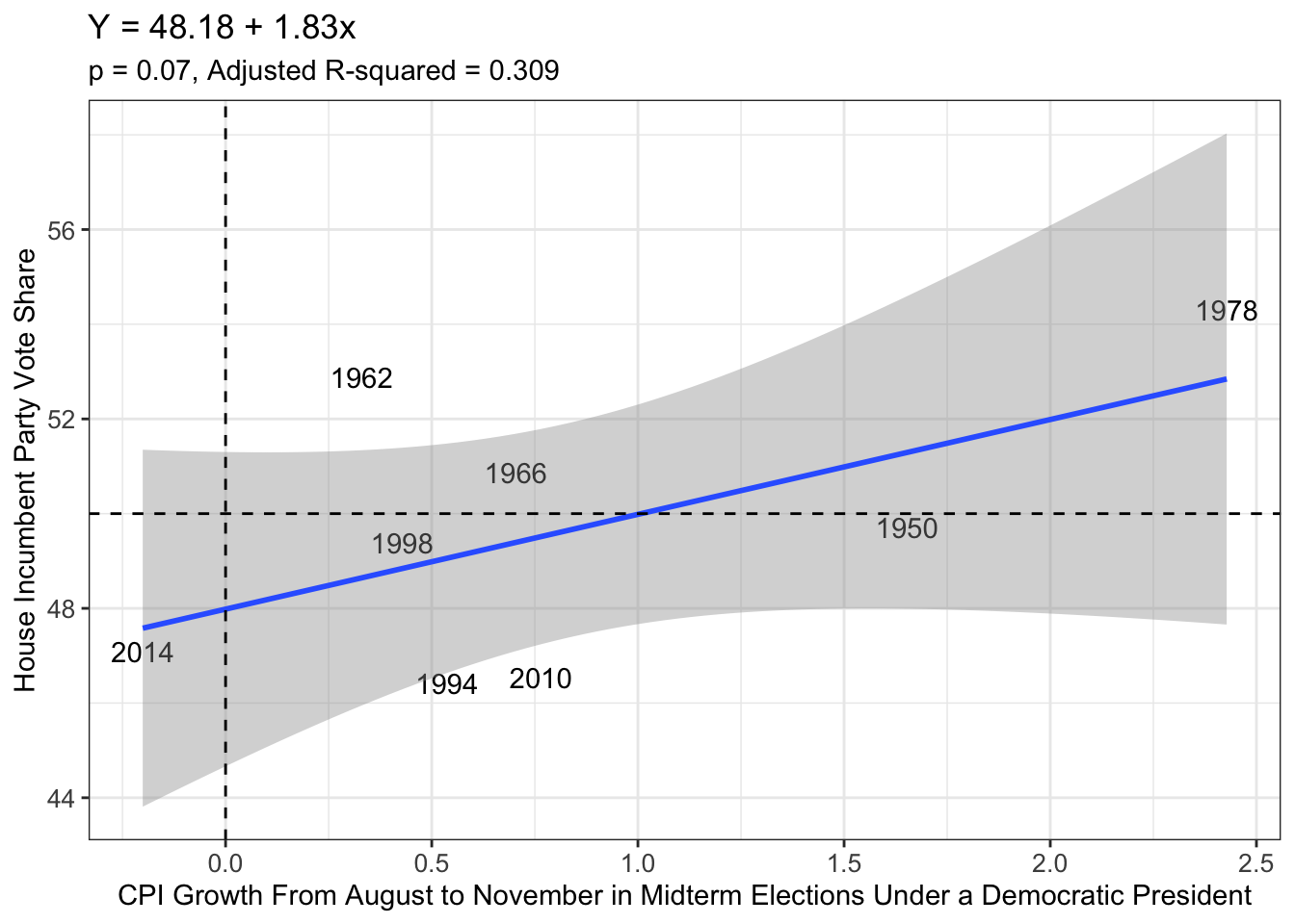
Because the electoral issue of inflation has been dissected and examined over-and-over during this election year, I specified my model further in an attempt to find any strong correlation. Thus, I narrowed my existing data to midterm years where there was an incumbent president. After all, many voters tend to punish the incumbent president’s party when they feel he has not performed the job well. Therefore, these next plots, still focused on the change in Consumer Price Index right before the election, show the fate of the House incumbent party with regard to their vote share and seat share in a midterm when a Democratic president is in office.
House Incumbent Party Vote Share
Democratic Seat Share
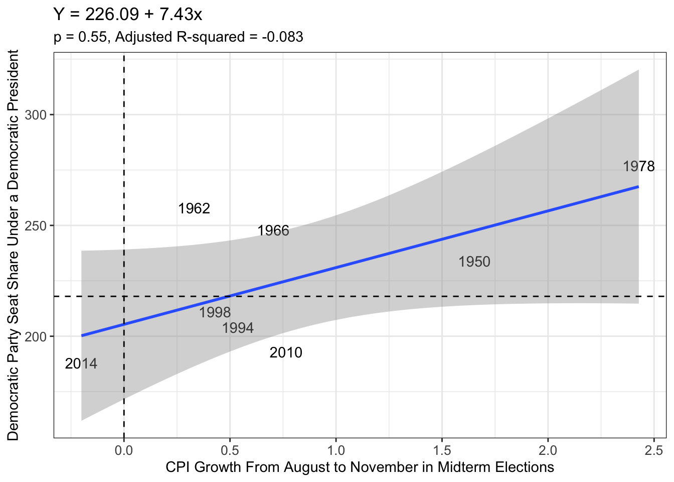 Here we see our model performs worse at explaining the variability in the data (smaller Adjusted R-squared values) but predicts a more realistic scenario in which Democrats would win a vote share of 52.57% and 243.9324 seats with Democratic President Joe Biden in office. Granted, these predictions are more realistic than the ones given by the previous model, but the seat share, especially, seems to be a number only progressives would dream of getting. Therefore, I cannot conclude that inflation is the only driver of voters’ decision at the booth during midterm years, meaning I have to look elsewhere for more predictive economic indicators.
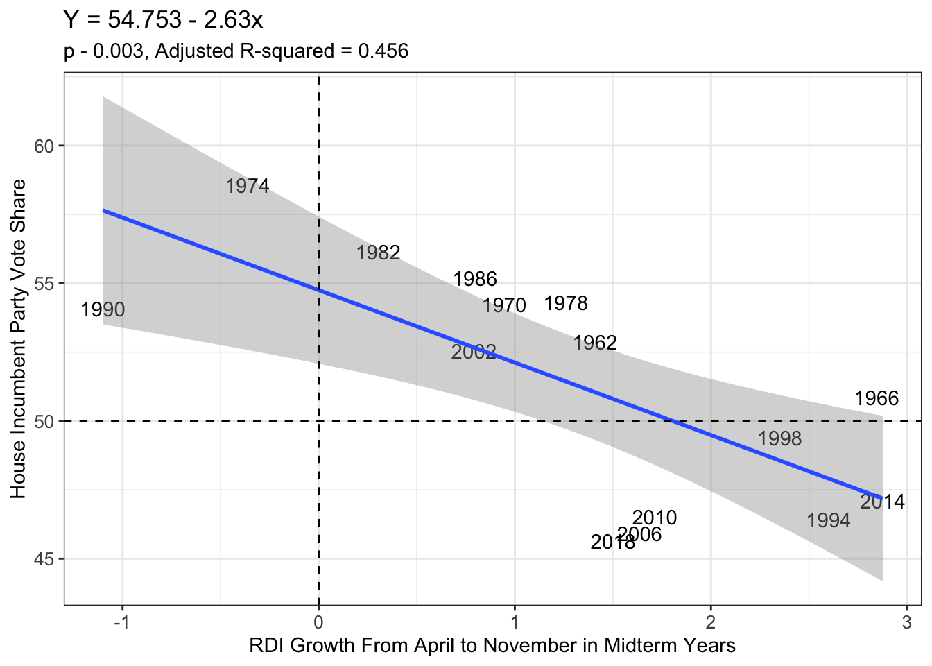
Real Disposable Income and the Incumbent Party in the House of Representatives
One of the best economic indicators that indicates a shift in the economic well-being of voters comes in the form of real disposable income (RDI), as pointed out by Achen and Bartels. Therefore, this measure should be a better predictor of how voters behave at the ballot box, since this statistic is so central to the individual. After playing with the data, I found the change between real disposable income from April to November of a midterm election year to best predict election outcomes (in keeping with voters’ recency bias). This time period is different than what I used for CPI, which should evoke caution for the reality that I simply found data that fit historical trends better after searching. Its predictive value may not be as valuable as it seems. However, the data seems to be promising, so it warrants a closer analysis.
In the plot below, a strong, negative relationship between the two variables is evident: for every percentage point increase in voters’ incomes, the house incumbent party loses 2.63 percentage points. The correlation coefficient of -0.709 confirms this, and the Adjusted R-squared value is the highest we have seen so far. Thus, the data does seem more promising for predicting outcomes so far, as well.
Effects on the Democratic Party’s Seat Share in the House
Here, the House incumbent party seat share follows the same strong, negative relationship with real disposable income changes from April to November of a midterm election. Staggeringly, almost 19 seats are lost by the incumbent party in the House for every 1% jump in real disposable income.
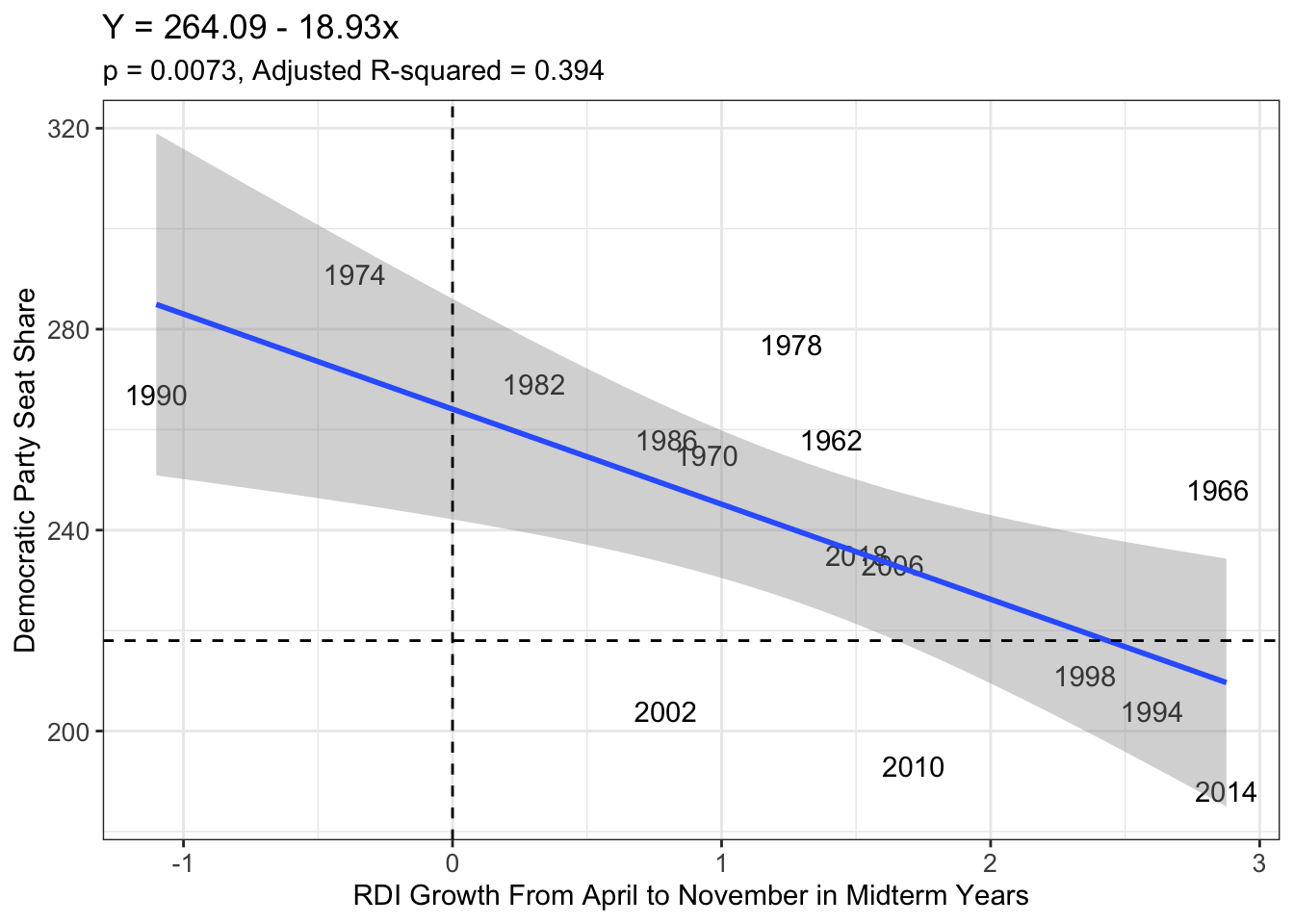
Interestingly, this model to predict the seat share is not as good at explaining the variability as the model that predicts the vote share. Without any further specification in the model, they predict a Democratic vote share of 49.72% and a seat share of 227.935, according to the Bureau of Economic Analysis which states RDI has grown by 1.91% since April. Comparing to CPI, voters’ real disposable incomes give a much more gloomy outlook for the Democrats, and yet one that seems closer to the predictions out there (like on FiveThirtyEight’s House Forecast).
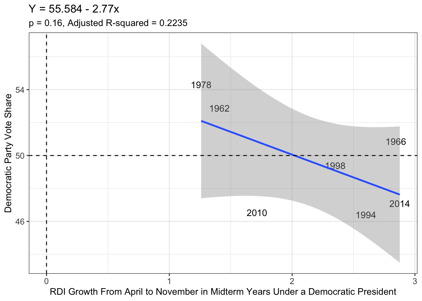
What Happens to the Democratic Party’s Vote and Seat Share When A Democratic President is in Office
In the same fashion as I did in the CPI models, I wanted to see the effect that an incumbent Democratic president had on this seat share model, as it would be more applicable to this year’s midterms. This is shown in the plots below.
Democratic Vote Share
Democratic Seat Share
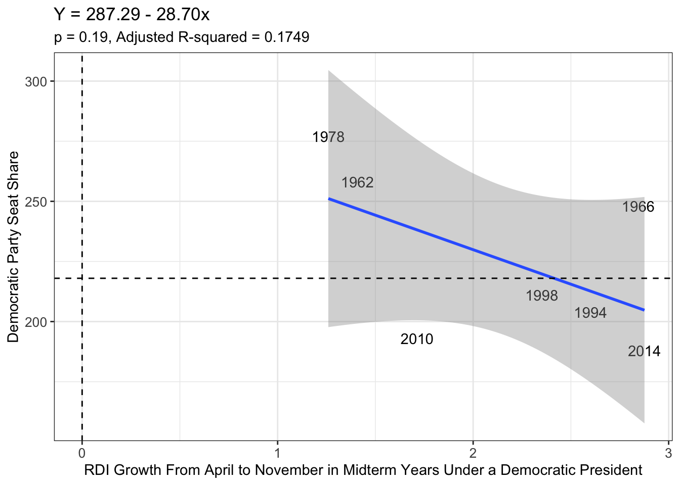 These models predict a vote share of 50.30% and seat share of 232.47 for the Democrats. However, these graphs may not have enough data to allow for conclusions to be drawn. In addition to that, our Adjusted R-Squared values are much worse on these graphs, too.
What Happens To Democrats When There Is A Democratic Majority is in the House
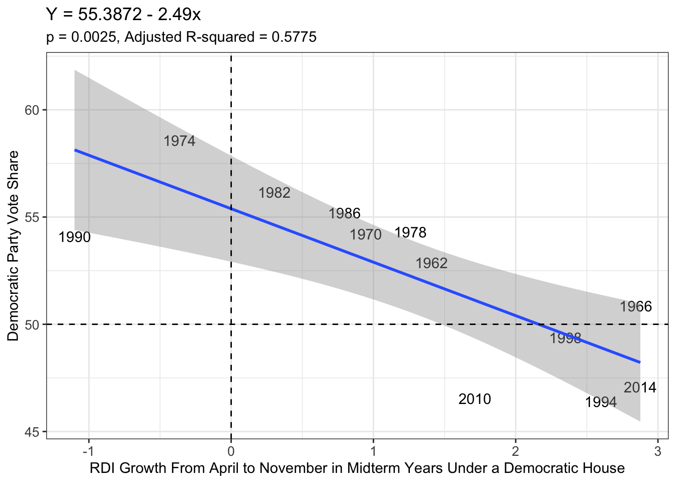
After seeing how real disposable income percentage change from April to November of a midterm election year was a better predictor of elections than CPI from August to November of that year, I decided another crack at improving my model was needed. Here, I control for when the Democratic Party is in power in the House of Representatives, maintaining my ability to apply it to this year’s midterm elections. Below are my plots for the House Incumbent Party’s Vote Share and Seat Share, depending on the percent change in RDI,
Democratic Vote Share
Democratic Seat Share
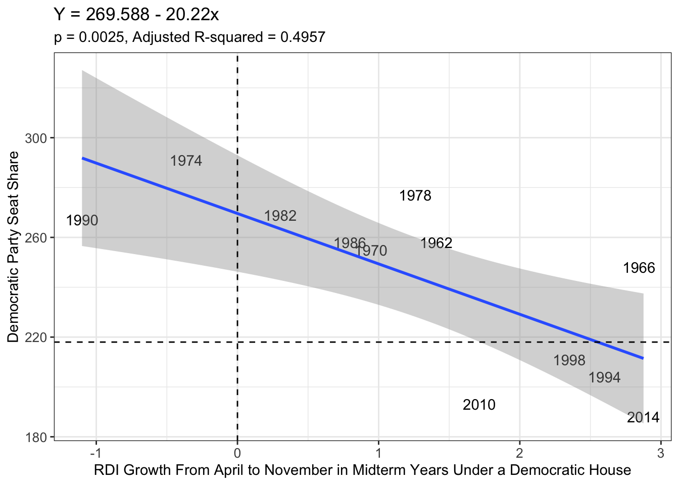
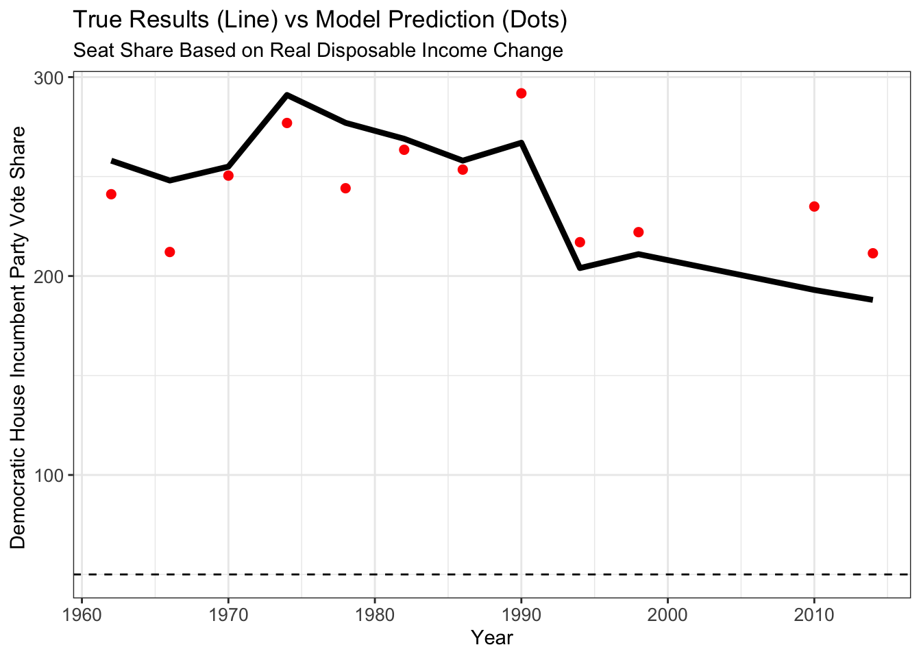
These models for the House Incumbent Party’s vote share and seat share are the most accurate out of all that have been created. Below are these models’ predictions and glimpses into how they perform when applied to previous elections.
Overall Prediction Based on Real Disposable Income Growth
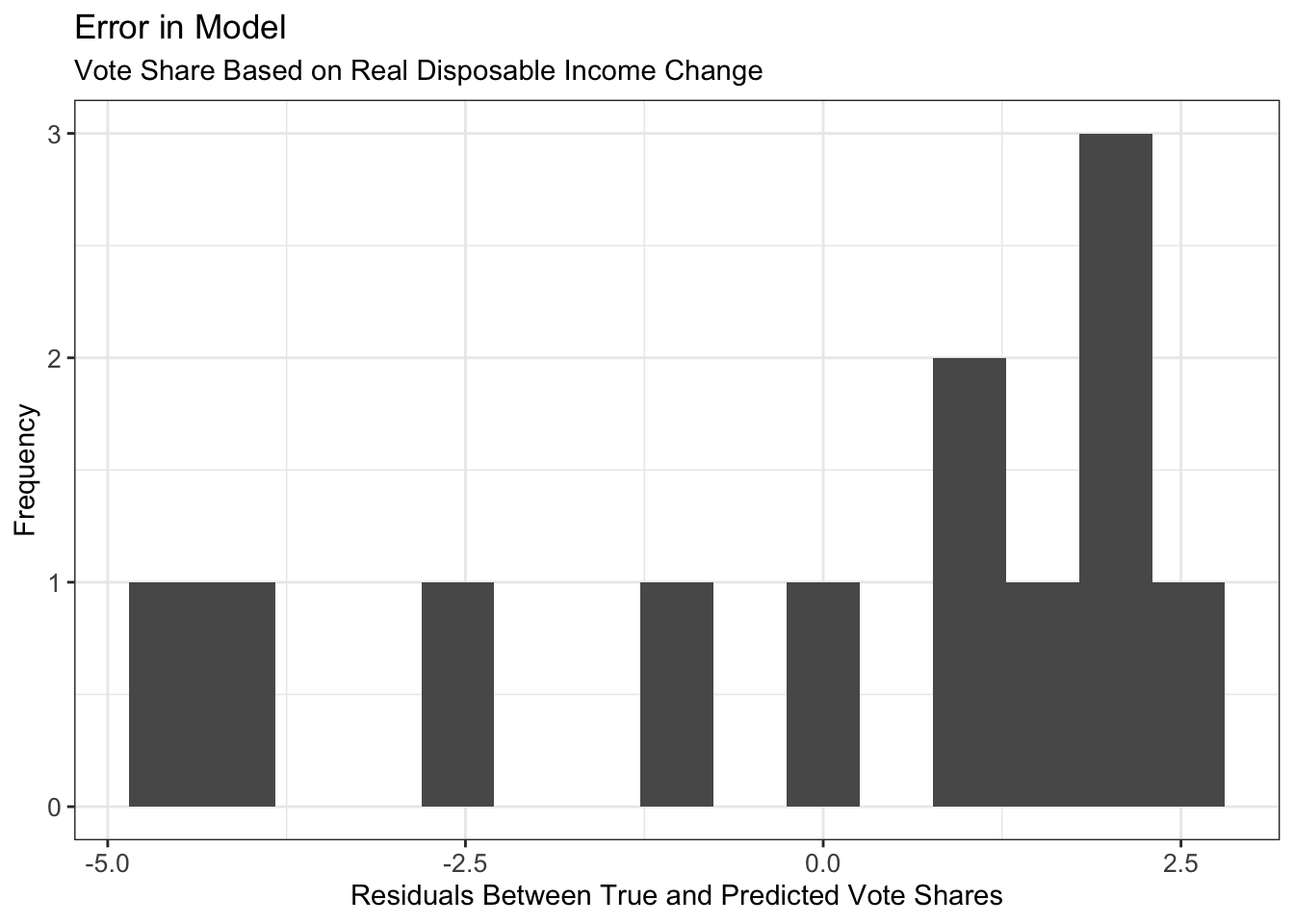
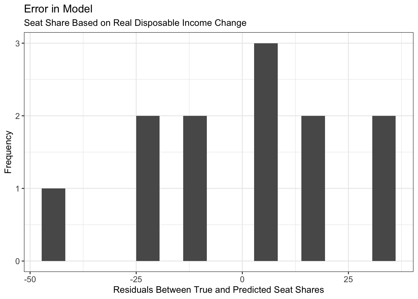
Below, these models’ forecasts and their corresponding prediction intervals are listed. Using the models that include the percent change in real disposable income from April to November in a midterm election year and controlling for years where the Democratic Party held the House to predict the Democrat’s resulting vote share and seat share, I predit the Democratic Party will win the popular vote with a 50.63% share of the votes and win a total of 230.97 seats (can round to 231 seats). My residuals (error between my predicted and the true vote/seat shares) have a wide range and are spread out, meaning this model is incomplete and not as accurate as one might prefer. This is mainly due to the fact that most voters simply do not think solely about their real disposable income when headed to the ballot box. It can be a piece of the pie in their considerations, and that means there are more factors (such as social and cultural variables, or even more economic variables) to include in my forecasting model.
How My Model Stacks Up Against the Past

Frequency and Magnitude of My Models’ Errors
A possible explanation for why these models, focused on who the incumbent party in the House is at the time, is the nationalization of politics and the reality that many voters use their party affiliation to decide who to elect. This phenomenon is exaggerated in races where voters tend to have less information and knowledge about the candidates, and congressional races tend to fit this bill. Without knowledge about the person whose name appears on the ballot, a voter will tend to rely on the party affiliation located next to that candidate’s name.
Additionally, the theme of party affiliation matters in the context of real disposable income. Voters tend to identify parties with what issues they are known to solve better than the other party. Scholar John R. Wright highlights how most voters are inclined to believe Democrats are best suited to fix employment when it is rising, hence why some say Democrats “own” unemployment. The issue of unemployment matters to voters because they need money in their pockets to feed, house, and cloth their families. When that cash in their pockets is flush and growing, voters do not need to look to Democrats for assistance. Instead, Republicans take over as the preferred party, as they are the party more trusted to keep money in control and in the hands of the people with less taxes and regulations, according to Wright as well. This is reflected in the models that take into account which party is running the House of Representatives at the time of the election.
These models are far from perfect, as seen having no Adjusted R-Squared value (the value that indicates how well the model explains variability in the data… higher is better) above 0.60, meaning the models explain no greater than 60% of the variability in the House incumbent party’s resulting vote share and seat share. Therefore, more factors will have to be added to the mix and thus, there is more to come on this blog.
Notes:
This blog is part of a series of articles meant to progressively understand how election data can be used to predict future outcomes. I will add to this site on a weekly basis under the direction of Professor Ryan D. Enos. In the run-up to the midterm elections on November 8, 2022, I will draw on all I have learned regarding what best forecasts election results, and I will predict the outcome of the NE-02 U.S. Congressional Election.
Sources:
House general elections, All States, 2014 summary. (2022). CQ voting and elections collection (web site). http://library.cqpress.com.ezp-prod1.hul.harvard.edu/elections/avg2014-3us1
CNN: US inflation hit 40-year high in June, driven by record gas prices